Mission Critical Design Systems
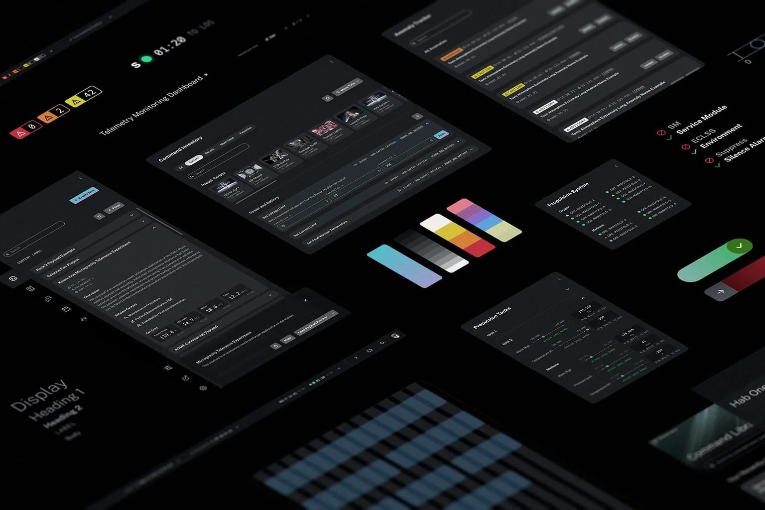
Design System for Space
This article was written in collaboration with Clint Rule and published at Teague.com
Design systems can be lifesavers.
They establish the design components—buttons and colors, for example—that make navigation easy for end users and create a unified look for the brand. Yet in mission-critical environments, the design system can mean the difference between failure and success, as they support products that must perform perfectly to keep interconnected systems from cascading into catastrophe.
There’s no room for trial and error in mission-critical environments. Unfortunately, confusing user interfaces have contributed to accidents since the dawn of their existence, ranging from inconveniences to tragedies. For example, Hawaii falsely sent out a “missile attack alert” to all residents in 2018 due to user error on a clunky menu of options—tragic, no, but certainly traumatizing for message recipients. In 2019, the blaze that nearly destroyed Notre Dame in Paris raged for 30 minutes undetected because the fire alert system was unclear in its initial warning. Unfortunately, a poorly-designed user interface can also contribute to loss of life, as occurred in the 2017 crash of the Navy ship USS John McCain, for example.
Drawing on a century of designing for complex use-cases such as space stations, rail operations, and the battlefield, Teague has identified several tactics that inform the mission-critical design systems that we work on. This article touches on three competing demands that are typical of mission-critical products and how design can address each of them.
Situational awareness is important, but a clear user interface is vital.
In 2017, a train on its way to Portland from Seattle derailed. It took 20 seconds for the engineer to decipher audible and visual alarms, leaving a mere five seconds to initiate emergency brakes before the deadly curve. The user's situational awareness is crucial, yet it is possible to design a system where tools provide vital time to avoid disaster. When design systems afford a rich, consistent taxonomy of status and alert types with visual and auditory clarity, the resulting software elevates the effectiveness and prevents catastrophic scenarios.
Rail control system designed by Teague
Teague partnered with a rail operations company to overhaul the design of their software and the tech stack that supports it. Our research found that users struggled when receiving numerous alerts, and were not able to efficiently prioritize their responses within the dense, multi-monitor UI. To solve for this, Teague introduced a streamlined, hierarchical design system that maintained a high degree of informational detail and an action-oriented status and alert system that minimized alert fatigue.
Humans must remain in-the-loop as approvers or deniers.
When lives are on the line and consequences are high, control interfaces must have a full buy-in from the individuals who rely on them. It’s not enough to rely solely on regulation requirements or designerly interpretation of user research. Designating specific users as part of the formal approval process ensures vital nuances of what must be true are treated as gating mechanisms in the design process.
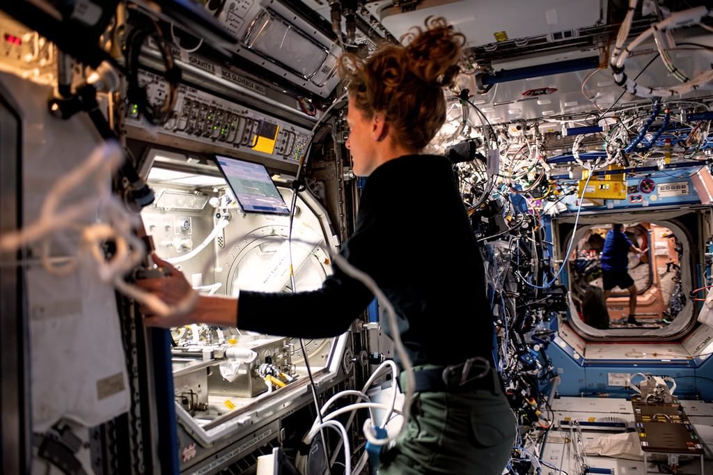
Work onboard the International Space Station
When Teague was asked to help build user interfaces for the next generation of space stations, we engaged in constant collaboration and knowledge-sharing with NASA-trained experts. This involved investigating intricate requirements with engineers and then translating them into solutions we’d iterate over with astronauts bound for space, or flight operators responsible for mission success. No solution advanced without the crucial approval of these subject matter experts. Ultimately, it was their jobs and lives that hinged on the flawless performance of this software they relied upon.
Design for highly regulated spaces requires specific expertise.
Mission-critical user interface design is a perfect example of the theory that “constraints yield creativity.” The expectations of the FAA, DOD, and other governing bodies reach far and wide, impacting not only product requirements but the design and development process itself. The creation of a successful mission-critical design system requires its designers to comfortably breathe the atmosphere of abstract regulation while delivering specific, modern solutions that meet concrete user needs.
The team responsible for creating a design system for mission-critical spaces must be fully immersed in compliance and able to navigate the intricate regulatory landscape. Every part of the design process must be meticulously crafted to meet security requirements and trace back to regulatory mandates, from documentation to design decisions.
Design systems are indispensable in mission critical settings.
In high-stakes settings, design systems transcend their status as tools for aesthetics and brand unity. In mission-critical environments, they act as the linchpin within intricate, interconnected systems that can spell the difference between survival and disaster.
Design systems are essential components of our digital infrastructure, ensuring not only user satisfaction but also stability and safety in mission-critical settings. As we continue to navigate the ever-evolving landscape of technology and interconnectivity, the value of design systems in safeguarding lives and livelihoods cannot be overstated.


