Designing for a
Commerical Space Station
Intent
Build the digital foundations for a next-generation commercial space station.
This work focused on astronaut-facing software and Mission Control tools in an environment defined by extreme constraints: safety, cognition, precision, and systems that did not yet fully exist.
In this context, design was not about expression or novelty. It was about establishing trust in software that would be used under pressure.
Context
I worked with a multidisciplinary consultancy which partnered with a commercial spaceflight company to design both the physical interiors of the station and the digital systems that would operate it.
I worked across two efforts:
Astronaut-facing interfaces, where software functions as onboard instrumentation
Mission Control software, where ground teams monitor and operate the station in real time
The two systems were deeply connected, but the constraints (and users) were very different. This project presented some of the most challenging problems in my careers, where precision was paramount, and lives were at stake.
My Role
Senior Interaction Designer
I focused on:
Framing interaction problems in high-risk environments
Modeling complex systems before visual design
Translating subject-matter expertise into usable interaction logic
Aligning teams around shared patterns and long-term structure
I worked closely with designers, engineers, researchers, and astronauts across multiple teams and locations.
Astronaut Interfaces
Part ONE
Software as instrumentation,
not “apps”
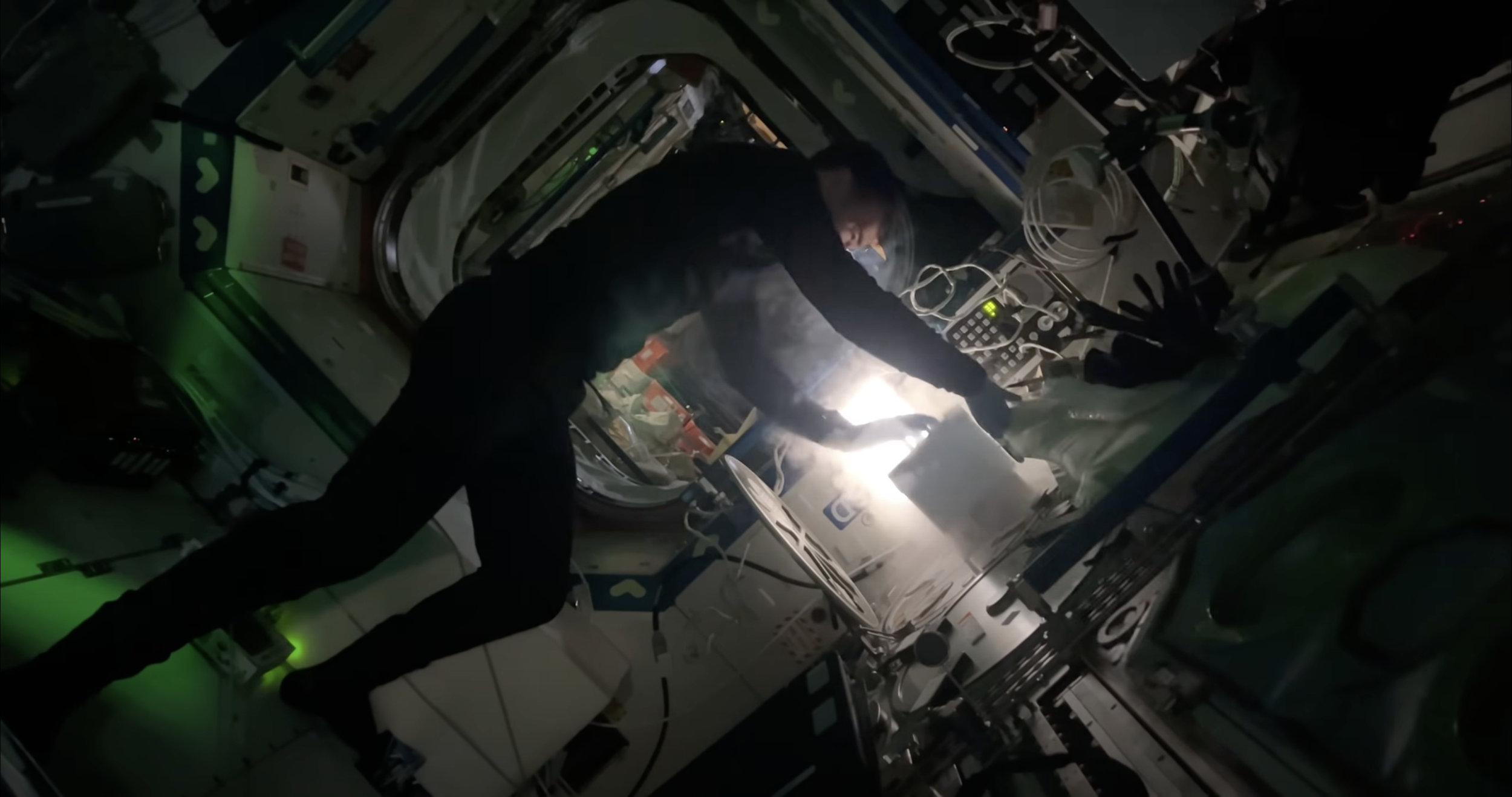
Astronaut-facing software is not a collection of apps. It functions as operational equipment — their primary tools for performing tasks, communicating, and managing their habitat.
These tools needed to support:
High cognitive load
Rare but critical edge cases
Physical constraints of microgravity
Users with deep expertise and little tolerance for ambiguity
At the same time, the system needed to scale beyond a small group of highly trained astronauts toward a more commercial future.
The central challenge was not visual polish, but establishing interaction logic that could be trusted.
Keep research continuous, not phase-based
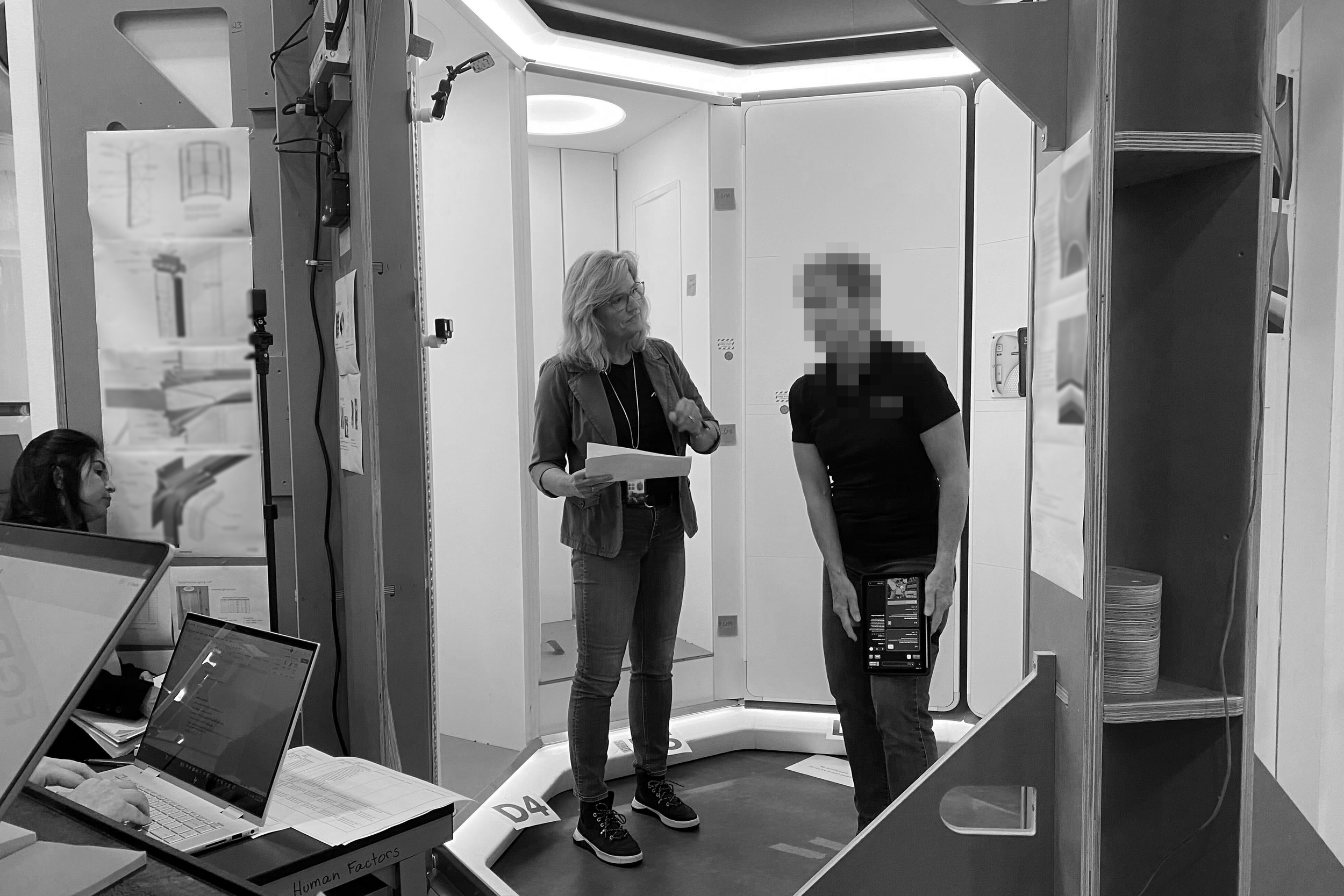
We worked closely with NASA-trained astronauts, flight operators, and safety leaders through interviews and working sessions.
Rather than treating research as a discrete phase, we used it as a continuous feedback loop to refine:
Mental models
Interaction patterns
Error-prevention strategies
What surprised me most was how quickly astronauts responded to clarity and familiarity. When interfaces aligned with known patterns, trust increased.
In high-risk environments,
intuition beats cleverness.
Establish system logic before designing screens
Early on, I chose to model the Command & Telemetry Library as a system before designing UI.
Using UML, I mapped:
Feature relationships
Data dependencies
Points where errors could cascade
This model became the foundation for wireframes, high-fidelity prototypes, and future application planning. It also gave teams a shared reference point when questions or disagreements surfaced.
The system logic outlived any individual screen.
Challenging an Early Assumption
During an early review of the Command & Telemetry Library, the Chief Astronaut looked at our first draft and said plainly, “I wouldn’t use this.” Given that this was a flight-required application, it was a sobering moment.
Rather than defending the work, I paused and asked questions. What followed reframed our understanding of the problem. Astronauts don’t (and can’t) fully internalize every system on the station. They rely on shared knowledge, clear procedures, and interfaces that support execution rather than comprehension.
That moment reinforced the importance of designing for procedural clarity over conceptual completeness, and it directly informed how we structured commands, telemetry, and error states moving forward.
Design interaction for microgravity, not Earth-based assumptions
Research quickly surfaced that touch interaction behaves differently in microgravity
Objects push away from the user
Fine motor control is harder to maintain
Accidental input carries higher cost
This directly informed interaction choices such as:
Large touch targets
Generous spacing
Reduced reliance on precision gestures
These were not aesthetic decisions. They were risk-reduction measures.
Designing in parallel with a shared system
Astronaut interfaces and Mission Control software were developed at the same time. Rather than creating isolated solutions, we worked toward a shared interaction language:
Components reviewed across teams
Patterns tested and refined weekly
Decisions documented and revisited
This alignment reduced fragmentation and made the system extensible as the organization scaled.
A North Star, not a finished map
When I joined the project, early concepts already existed for a suite of station applications.
My contribution was helping evolve these into a cohesive ecosystem rather than a collection of point solutions. Compared to the International Space Station’s patchwork of legacy systems, this represented a meaningful shift in how commercial spaceflight software could be structured.
The outcome was not just applications, but a shared vision the organization could build toward.
Documentation as leverage
Many commands and data points were not finalized during design. To work responsibly within that uncertainty, we focused on:
Documenting interaction logic and intent
Establishing reusable patterns
Providing examples instead of rigid prescriptions
This allowed future teams to extend the system without revisiting foundational decisions.
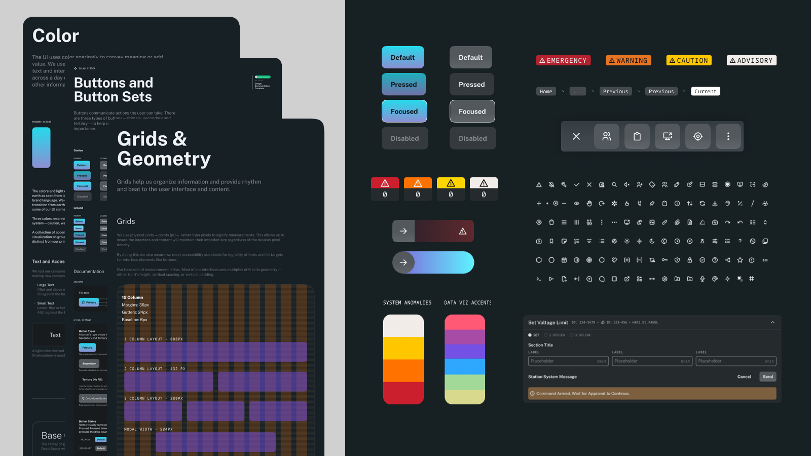
A consistent DLS for in Space and on the Ground
Part TWO
Mission Control Software
A different problem space
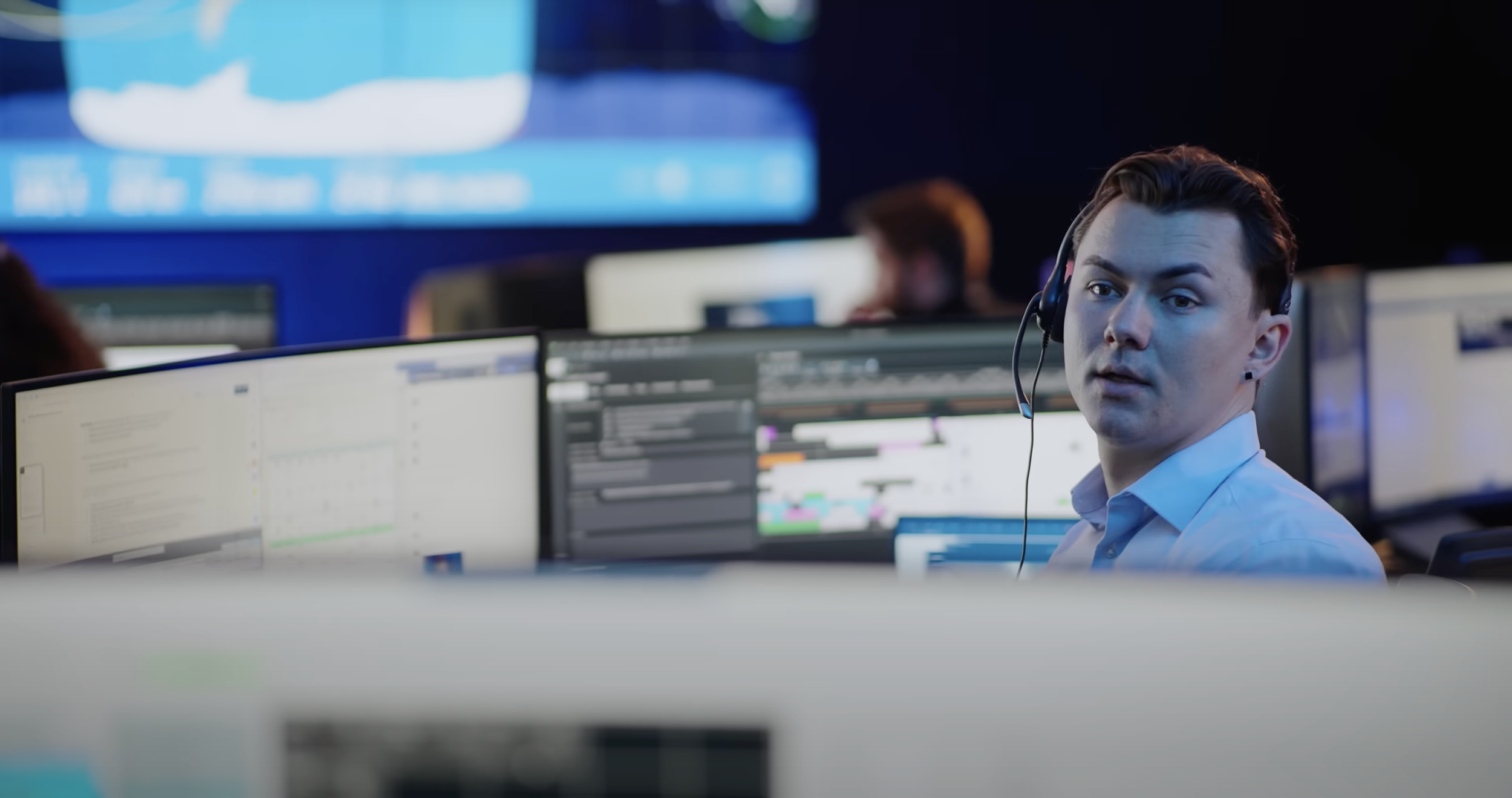
Following the success of crew interfaces, my consultancy was asked to help accelerate Mission Control software design. This new challenge presented us with a different set of constraints. Unlike astronaut interfaces, ground-based tools needed to support:
A broader range of users
Rapidly evolving requirements
Continuous, real-time operations
Midway through development, significant budget cuts reduced both time and scope. The goal shifted from building polished software to establishing a foundation that could survive handoff and growth.
My consultancy was given two weeks to help stabilize the effort. After that, I remained embedded as the sole external designer for two months.
Slowing down to move faster
The internal team handled complexity well but relied heavily toward high-fidelity work.
Given the complexity of the system, this made it difficult to reason about structure early. I encouraged a return to low-fidelity exploration — mapping interaction models quickly and comparing alternatives without attachment.
By increasing fidelity only after structure was sound, the team was able to:
See the system holistically
Identify inconsistencies earlier
Move faster with fewer reversals
In an industry increasingly optimized for speed, this restraint proved valuable.
Diagram showing how reusable interaction patterns could house different elements of content:
Introducing structure without disrupting momentum
Within two weeks, our team established a foundational interaction model for Mission Control software.
The goal was not to replace existing work, but to introduce just enough structure to:
Unify parallel efforts
Give the team shared language
Reduce friction in design discussions
The model became a reference point the team could build on without losing momentum.
Impact & reflection:
This project reinforced several principles in my practice:
Clarity is a form of care
Interaction models outlast screens
Senior design work often involves choosing what not to design
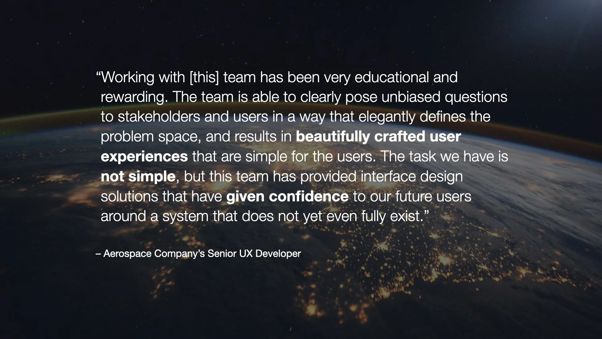
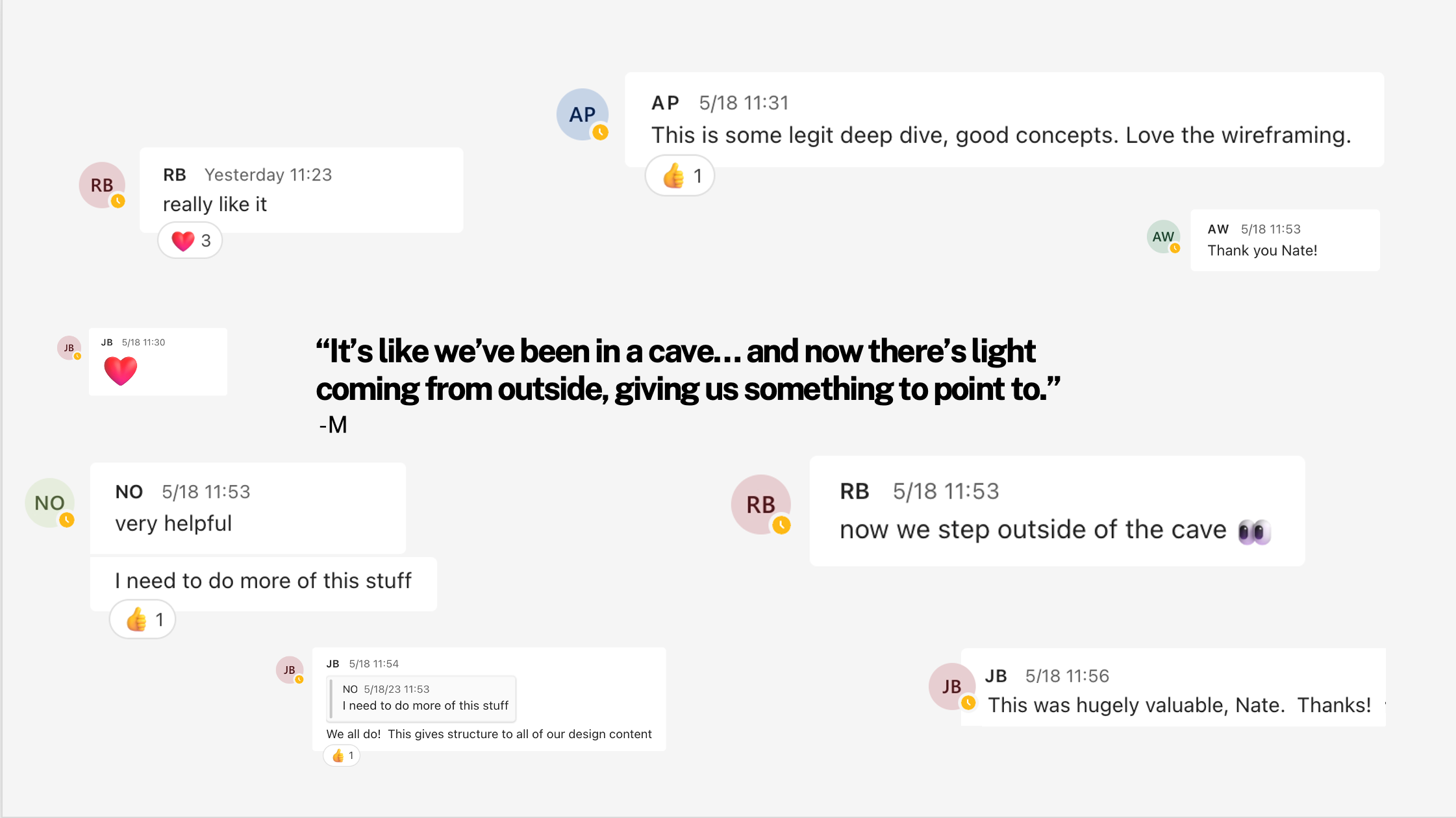
The work was well received by astronauts, flight controllers, engineers, and designers for its clarity, restraint, and usability.
Closing:
Designing software for spaceflight is rare. Designing it responsibly requires judgment, humility, and systems thinking.
This project sharpened my ability to:
Frame ambiguous, high-stakes problems
Align diverse stakeholders
Design systems that prioritize trust over novelty
It’s work I’m proud of — not because of how it looks, but because it holds up under pressure.


