In-Flight Entertainment
Handset Development
The Intention:
Build the next generation handset for IFE.
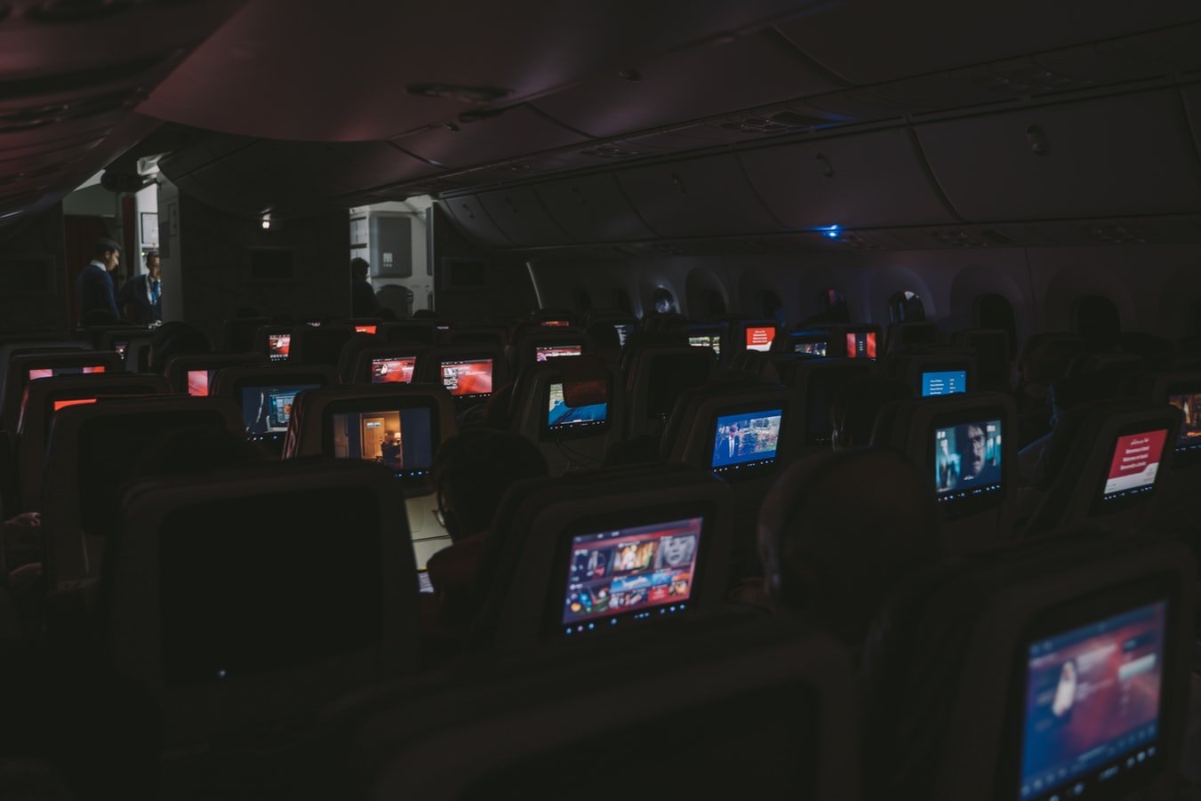
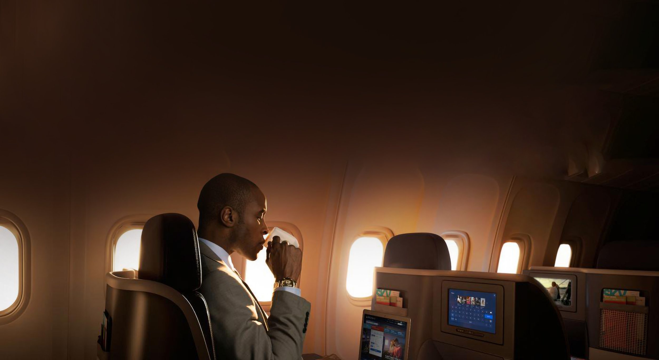
An avionics company engaged Tactile to design and develop a groundbreaking physical controller for their business and premium class In-Flight Entertainment & Connectivity (IFEC) system. As the UX designer, I collaborated closely with the industrial designer, fostering a dynamic exchange of ideas to ensure usability and seamless control. Together, we explored innovative interaction concepts that merged physical and digital elements.
The six-month project had three phases: discovery, exploration, and prototype. During the discovery phase, we conducted competitive analysis and lateral market research to establish foundational interaction patterns. In the exploration phase, I created an interaction model, and our team presented three hardware concepts: an all-digital design, an all-physical design, and a blended architecture. The client selected the blended approach, leading to the prototyping phase, where our team produced a working physical prototype integrated with a functional software prototype, demonstrating the system’s full potential.
My Role
Senior UX Designer
UX Research
UX / UI Design
Prototyping
The Tactile Team
Tactile – Seattle
Aaron Piazza – Design Director
Adam Weisgerber – Industrial Designer
Spenser Dodge – Initial Industrial Designer
Marcus Pape – UX Director

Phase ONE:
Research In-Flight Tasks and Tech
We began by collaborating with our client to identify and prioritize the key tasks for the IFEC system. Using insights from both the client and our team, I used a task scoring framework to evaluate each task’s importance. The scoring ranged from 0 (not applicable) to 3 (critical), with 1 indicating “plausible.” This framework provided a clear structure to assess which technologies and interactions were most promising, forming a strategic foundation for the project’s next phases.
Phase TWO:
Exploring an Interaction Model
With a clearer understanding of the tasks and technologies to prioritize, we began shaping the experience by establishing boundaries and focus areas. I distilled the key actions required to perform these tasks into basic interaction patterns, mapping them to physical interfaces. This process created a shared vocabulary for our team and client, enabling productive discussions and ensuring alignment on best practices for usability and design moving forward.
Basic interaction patterns mapped to physical interfaces
Traffic-light ratings for physical interaction patterns
Phase THREE:
Prototyping the Experience
The Industrial Designer and I collaborated closely to define product solutions and shape the overall user experience. I focused on designing interactions and screen interfaces based on our task explorations, while he refined the physical details of the buttons and housing for the remote.
To bring our concepts to life, I built an initial prototype using an Apple TV remote, which allowed us to simulate the user experience and gather early feedback. Once the prototype was approved, our team developed a custom-built physical controller that seamlessly integrated with the on-screen interface, delivering a cohesive and functional demonstration of the system.
Final Prototype
To ensure user testing focused on interactions rather than content, I simplified the interface, reducing visual complexity while preserving key functionality. The video below demonstrates how the on-screen interface responds dynamically to the physical controller, showcasing seamless integration between hardware and software. Additionally, the design was thoughtfully crafted to accommodate both physical controls and touch screen interactions, ensuring versatility across different input methods.


